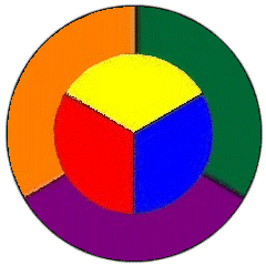
Our main page
Our tutorials page
Information about glaze & mediums
Where to buy brushes, tools, glaze etc
Site-Map

Colour

The colour-wheel


All colours can be made from the three  "primary colours":  Red, yellow & blue (seen here in the centre of the colourwheel)   + black and/or white.

2 primary colours combined, make a "secondary colour": Orange, green or purple
i.e.   Red + yellow = orange.   Yellow + blue = green.   Blue + red = purple.

2 secondary colours combined, make a "tertiary colour".


  Each colour can be altered in several ways: Hue, Saturation & Lightness.

  Hue. The characteristic that gives colour it's place in the spectrum,
with red running into yellow via orange.   As seen in the colour wheel.
Saturation. The degree of intensity or richness; Less saturated colours appear 'duller'.
The greater the colour content, the greater the saturation.
Lightness. The degree of lightness; varying from light to dark.   
Often referred to as the 'shade' or 'tone'.


A decorators view on the use of colour in the home or workplace.


  Many people find it extremely difficult to make decisions regarding colour.
  A carefully chosen colour scheme can make an immense difference to the optical dimensions & general feel of a room.
  When painting a small or dark room, consider the following:
    * Reflect as much light as possible.
    * Lighter shades of paint contain more white (obviously), which reflects the light and bounces it back into the room.


  Colours have certain attributes, which should be taken into consideration when devising a colour scheme.
  Greys, greens and blues are cool colours; reds, oranges and yellows are all warm colours.
  When choosing colours it would be wise to select cool colours for sunny areas and warm colours for cold areas.
  Warm colours advance and stand out more than cool colours, which tend to recede.
  Light colours tend to make an area seem larger whilst dark colours have the reverse effect.
  Dark colours can hide the dirt and in some areas this may be useful (e.g. on dados and doors),
  but dark colours absorb more light and cannot provide bright interiors, most commonly desired.
  Dark colours can feel depressing and creating poor visibility giving rise to eyestrain, causing headaches and general fatigue.
  Clean, light surfaces provide better visibility.
  To enhance richly coloured furniture, paintings etc, consider light neutral grey or cream backdrops,
  but in many cases, soft grey-green or grey-blue would also be appropriate.

  Consider the following when using artificial lighting within a room:
  Warm white, peach and similar tinted fluorescent tubes will:
    * de-base the appearance of cool colours such as greens and blues.
    * Enhance warm colours such as creams pinks and tans.
  Sodium and Mercury lighting should be avoided where possible since their effect on colour is drastic,
  and in certain cases a total loss of colour can be expected.
  It is advisable therefore to view any proposed colours under this type of lighting before proceeding with any colour scheme.

  Above all, your choice of colour is individual to you!


© Copyright 2000 Painting-Effects
In association with www.graining.co.uk